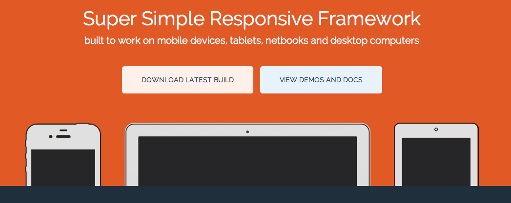
Base Framework
Nowadays designers and web developers need to prepare their projects not just for a number of popular web browsers, but also for drastically different screen sizes of tablets, notebooks and wide screen desktop displays. The Base Framework by Matthew Hartman gives developers a head start by featuring simple design grid that already features the necessary responsive design elements to comply with an array of different screen sizes. The tool includes bare .PSD grid element for design work, a basic HTML5 template to begin your coding and a minimal style sheet for quick customization.
* * * * * * *
No Comment