Mobile, Responsive
Mobile:
Resources and tools for mobile apps creation, mobile SEO and best practices.

Interlacing Patterns
Subtle patterns and textures are commonly implemented as visually appealing backgrounds without drawing attention away from the actual content on a site. This set of seamless patterns is ideal for creating responsive backgrounds that will align nicely for web projects. The patterns are available in .PSD format for customization and
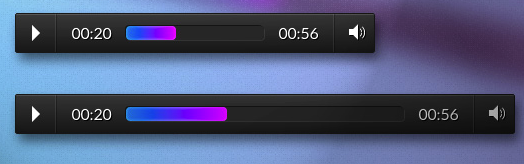
Responsive and Touch-Friendly Audio Player
Thanks to improvements in HTML standards and JavaScript libraries websites no longer have to rely on embeddable elements to host audio files on a page. Unfortunately these type of elements are not easily stylized using common CSS practices. The team at Tympanus developed this that is both stylish and functional.

Egrappler Full Screen Responsive Slider
Thanks to the prevalence of jQuery, content sliders or carousels have become a must-have for many websites. The crew at Egrappler has taken the content slider to the next level by creating a full-screen responsive slider to cycle through content and images in the largest possible format. Egrappler includes a

Plunk App
Mobile is the wave of the future for web traffic. Don’t get left in the dust with a lackluster mobile product that fails to take advantage of touch-sensitive devices and the responsive design framework or function at all on a mobile device. Plunk App was developed by the ZURB team
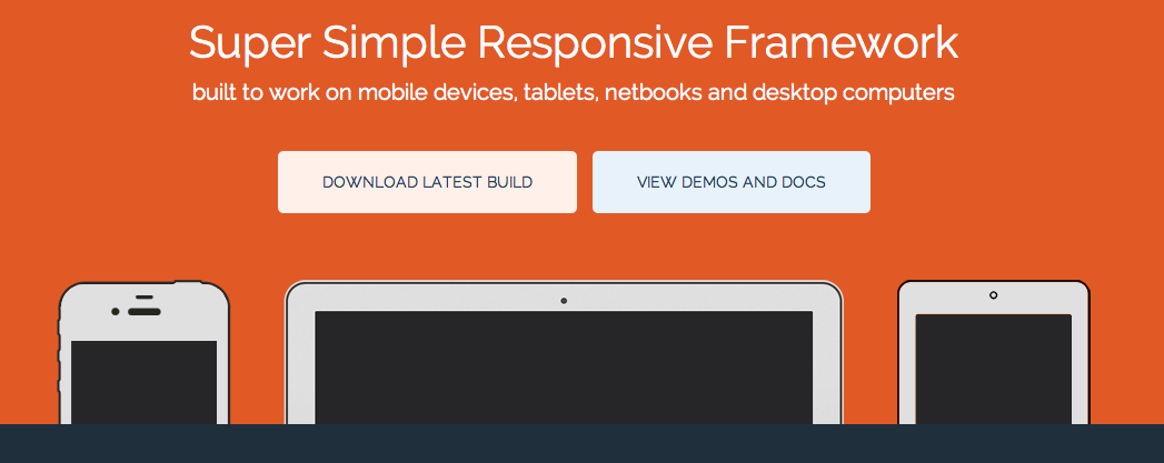
Base Framework
Nowadays designers and web developers need to prepare their projects not just for a number of popular web browsers, but also for drastically different screen sizes of tablets, notebooks and wide screen desktop displays. The Base Framework by Matthew Hartman gives developers a head start by featuring simple design grid
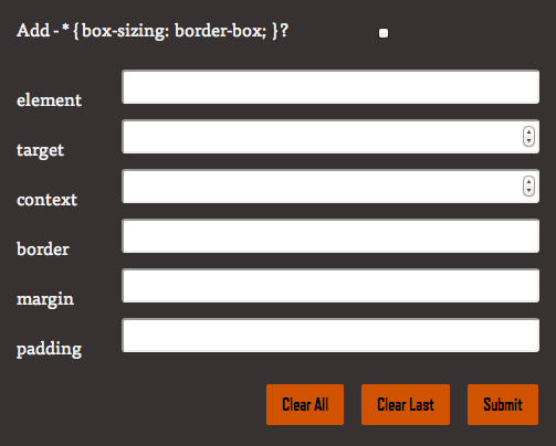
Responsive Calculator
Responsive web designs are developed to handle the unique visual requirements of mobile devices, tablets and traditional displays. The Responsive Calculator speeds up the design process by converting .PSD files into a basic HTML5 template that is ready to be turned into a responsive webpage. The tool transforms pixel based
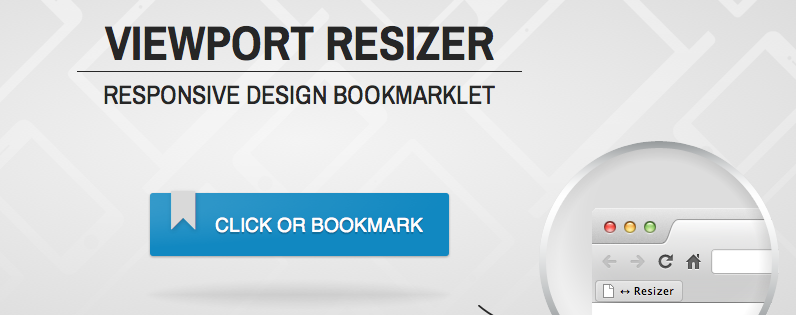
Viewport Resizer
Testing and debugging for different screen sizes can be a tedious task, optimize the process with the View Port Resizer from Malte Wassermann. The Viewport Resizer is a bookmarklet added to your web browser that lets users adjust the viewing options to account for different browsers and different digital platforms.