CSS Grid
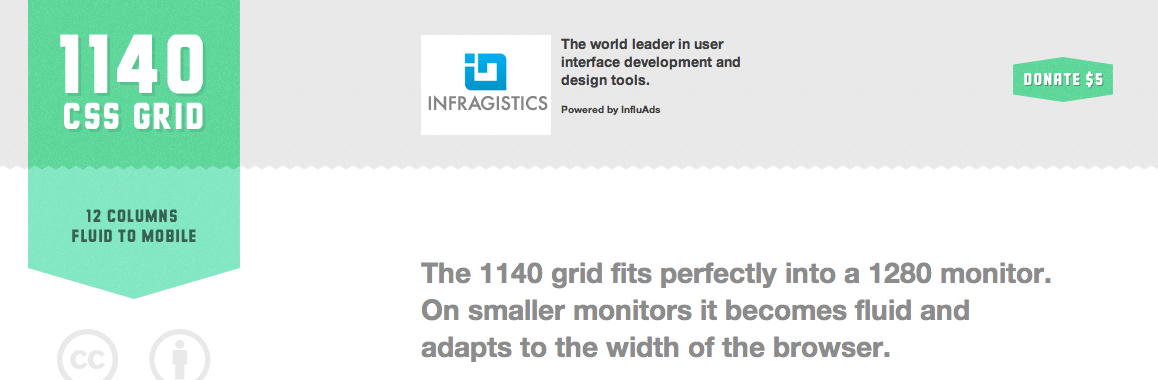
CSS Grid provides a customizable layout that is capable of handling up to 12 columns of content for a given webpage. The grid is designed to fit seamlessly into a 1280 monitor and automatically readjusts for smaller monitors and browser windows. Images will be shrunk to fit the width of columns. The fluid widths are even capable of adapting to mobile and tablet browsers, making your content available on as many screens as possible. The code is tested to work for Chrome, Safari, and Firefox as well as IE7 & IE8. The team at CSS Grid includes an explanation of the HTML and CSS markup as well as a Photoshop Template of the code so it can be implemented into current projects with minimal adjustments.
* * * * * * *
No Comment