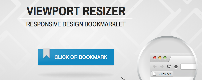
Viewport Resizer
Testing and debugging for different screen sizes can be a tedious task, optimize the process with the View Port Resizer from Malte Wassermann. The Viewport Resizer is a bookmarklet added to your web browser that lets users adjust the viewing options to account for different browsers and different digital platforms. The tool is ideal for responsive design testing and allows users to see how their project would appear on a smartphone, on a tablet or on a traditional display and allows for live customizations to existing code.
* * * * * * *
No Comment